Y’all! Yesterday, I was looking at the “before” tour of our house and couldn’t believe just how far we’ve come in a matter of 6-ish months. I get so caught up with allllllll of the things we still have left to do around here that I forget to see the journey sometimes.
Thus far, we have a living room, a breakfast nook, a powder room, a laundry room, and a guest/kid’s bathroom checked off of the to-do list, and a dining room and master bedroom mostly complete too. (Granted, no room is ever really finished, but you know what I mean.) We still have something like 10 rooms to go, the exterior to wrap up, and eventually a Phase 2 of more major renovations, but that list of check marks is already way more than we finished in even our first 2 years at the last house.
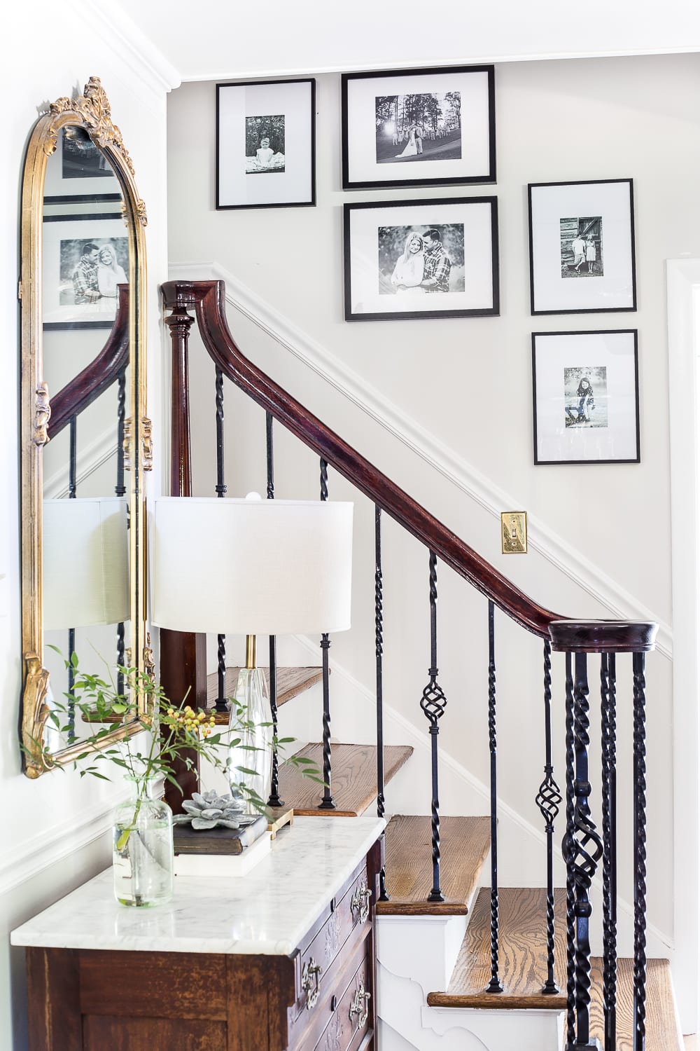
And now another one we can call 90% complete: the foyer. Remember this?

This space had so much charm already, but with a little paint, a couple of Craigslist finds, and some DIY lighting, it became more “us”.
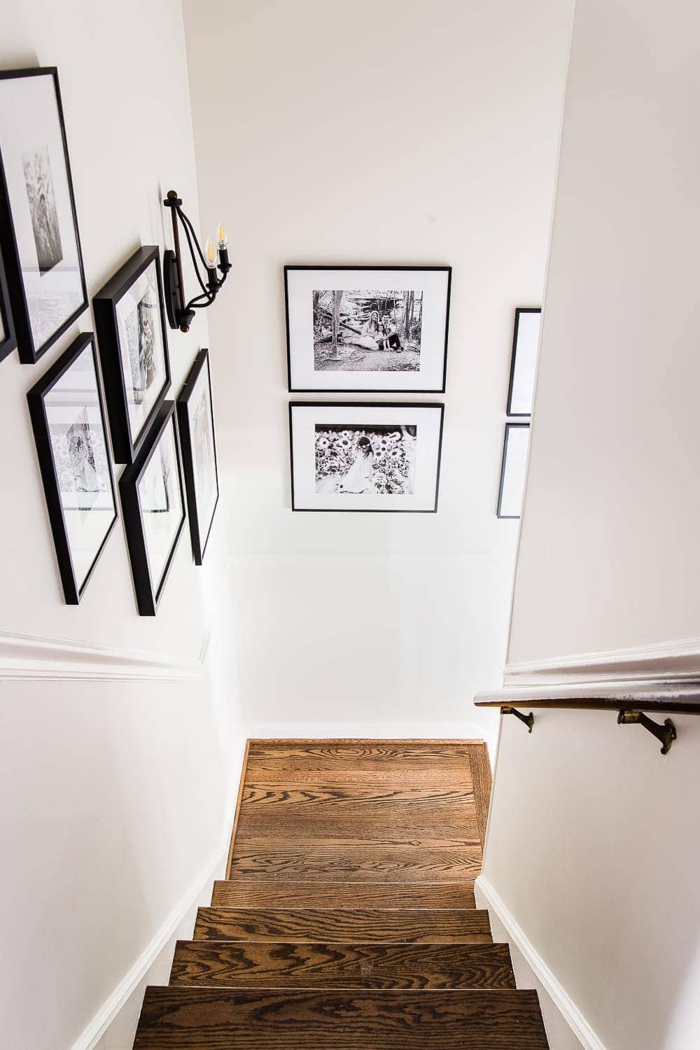
And now we’ve added a gallery wall to jazz up our empty stairway that stayed blank for so long.
It was just begging for a photo display, right?
The before and after of it all is somethin’ else.

I attempted the gallery wall at first by just trying to eyeball it. Big mistake, HUGE. (Said in a Julia Roberts a la Pretty Woman voice.)
Our wall started to look like Swiss cheese thanks to all of my oopsie nail holes.
So here’s the old faithful trick I always use (and should have used all along).

Wrapping paper.
I used this method in our last house too. Just trace your picture frames on old wrapping paper, cut them out, mark where the nail holes should go, place on the wall with painter’s tape, and move them around as needed until you’re 100% happy with the placement.

Here are a few more of my favorite tips, if you ever feel stumped on hanging a gallery wall for yourself:
1. Bigger frames are better.
There’s a fine line between a well placed gallery wall and one that just looks cluttered. If you stick to hanging a bunch of 5×7 frames and smaller, the gallery wall is going to look chaotic and messy.
Larger frames ground the layout, especially if you have tall ceilings. 11×14, 16×20, and 20×24 frames are the best to start with, depending on the size of your wall.

2. Hang where you want your large frames first, and then fill in with smaller sizes.
So for our stairway, I started by placing a cutout of this larger 16×20 frame at the top of our landing.

3. Use a long strip of painter’s tape to mark a diagonal line at the angle you want.
I luckily had a chair rail to guide me, but you can measure 3-4 feet from the top of each step, mark with a pencil, and connect the dots with the painter’s tape to find your diagonal line. As you hang your wrapping paper cutouts, place the bottom corner of the frame at the edge of the diagonal line you marked with the tape.

4. Stick to monochromatic or a consistent color scheme.
The more frames you have, the more cluttered it will look if you use lots of colors in your gallery wall. So I try to stick to a “theme” of colors. I love black and white because it’s simple and classic. But you can stick to a pastel color palette or primary colors or a scheme of different shades of blue, whatever your style. Consistency helps make it look polished and intentional.

5. Mat your art/photos if you want it to look more high-end.
A photo or a piece of art just feels more important to me if I stick it in a crisp, white mat. So if you want your wall decor to feel more upscale, mat what you display. My frames came already matted from IKEA and Target, but if you want to mat any thrift store frames you stumble upon, you can usually get pre-cut frame mats for $1-2 with a coupon at Michael’s
Some of my frames were originally silver and gold, but I spray painted them matte black to look like nearly identical Pottery Barn frames. (Mine were a quarter of the price though. Ha!)

Every time I walk into this room now, I find myself lingering around all of the sweet photos from my and Robert’s past 8 years together. Snapshots from our engagement, our wedding day, Olivia’s firsts as a baby, all of her little changes and growth spurts. I never ever want to take a single memory for granted, and I love that this stairway now keeps what’s most important at the very center of our home. It’s a reminder I need sometimes in the busy day-to-day hustle.
Now that this space is pretty much wrapped up, except for a few little tweaks (and maybe one day even a hardwood floor refinishing and adding more oomphy molding to go with that chair rail), we’ll be busting out the Christmas decor in here really soon. Eek! I feel like a kid on Chri… well, you know.
If you want to know about any of the sources in our foyer, you can see them all here:
- Wall color: Benjamin Moore Classic Gray
- Trim color: Benjamin Moore Simply White
- Door color: Benjamin Moore Wrought Iron
- Matted 5×7 frames (spray painted matte black)
- Matted 8×10 frames
- Matted 11×14 frames (spray painted matte black)
- Blue vintage style rug (similar- Mine was $110 from Safavieh, but it’s discontinued.)
- Marble topped chest ($130 Craigslist find)
- DIY semi-flush mount light
- Gold mirror (There are lots of gorgeous true antique mirrors on eBay too.)
- Lamp (Similar here, here, and here)
- Concrete statuette (DIY from a $1 figurine)
Do you have any tricks of your own to hang a gallery wall? Or do you have a gallery wall already hanging in your house? I have 2 more that I’d reeeaaally love to do spinning around in my head at the moment. Once you start, it’s hard to stop. 
If you want to save this post for later, you can pin it here:


The post How to Hang the Perfect Gallery Wall appeared first on Bless'er House.
No comments:
Post a Comment